A Deep Dive into Power Apps – Creating Custom Component

custom component on power apps
Table of Contents

Contributors

Vivasoft Team

Vivasoft Team

Tech Stack
0 +
Want to accelerate your software development your company?

It has become a prerequisite for companies to develop custom software products to stay competitive. Vivasoft's technical expertise.

Microsoft Power Platform is a suite of low-code development tools that enables users to easily build customized business applications. PowerApps is a key component of the Power Platform, allowing users to build mobile and web applications without extensive coding knowledge. One of the powerful features of PowerApps is the ability to create custom components, which are reusable elements that can be added to multiple apps. Custom components allow users to extend the functionality of PowerApps beyond its built-in capabilities and create unique, tailored solutions.

This series will guide you through the process of creating custom components in Power Apps.

In this article, we will take a deep dive into Power Apps custom components, we are going to

  • exploring what they are
  • know how they work
  • create a component.

What is the Component

In PowerApps components are reusable building blocks for canvas app containing one or more control within it. Components can use advanced features such as custom properties to enable complex capabilities.

What are the Uses of a Component

In any application, we may notice similar interfaces on different screens/pages. We can replace those similar portions by  component, which will reduce workload and save time as well.  Even if any change comes we won’t require to make the same changes in every screen or control, rather we can simply modify the component and the changes will reflect everywhere it has been used. 

Is there any Limitation of the Component

The component is mostly helpful though it has the following limitations-

  1. Can’t be used in galleries and forms
  2. Can’t be used inside another component

Creating a Custom Component on Microsoft Power Apps

Now let’s start our journey of creating components in Power Apps.

At the very beginning, we will require an app to design our components. So let’s create an app following some steps.

Creating Application-

  • Step 1:

Let’s select Apps section from the left panel. Then we will find a screen showing our available applications and at top of the screen, we will get options for creating a new application or importing any backed-up application.

microsoft power app

Fig-1: Application Screen

  • Step 2:

Clicking on the “New app” button we will get a window to provide the application name and type to start with the new application.

microsoft power app

Fig-2: New Application Window

  • Step 3:

Pick a name as you want and keep the “Tablet” format selected while clicking on create button. By clicking create button we will enter the application which is just been created.

Creating Component-

Since we are here to create components, let’s click on the components tab and start creating our very first component.

Clicking on the “New component” button we will get a blank component that can be renamed.

microsoft power apps

Fig-3: Component Editor Screen

Let’s rename it to sidebar_component.

power apps

Fig-4: Renaming the component

From the new name of the component perhaps you already got the idea. Yeah, you are right. We are going to design a component that will serve as a sidebar/navigation bar for our application. I guess the sidebar is the most repetitive part of any application. 

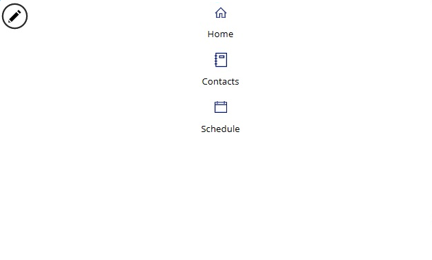
Now we are going to insert a blank vertical Gallery inside sidebar_component and rename it to sidebar_gallery. 

Inside the gallery, we are going to insert a label renamed sc_item_label and an icon renamed sc_item_icon.

microsoft power app

Fig-5: Component after inserting gallery, label and icon.

Now time to set some properties for inserted items.

Let’s set properties for sidebar_gallery like the below-

To get a tailored application hire Developers from us

				
					X:0
Y:0
Width: Parent.Width
Height: Parent.Height
TemplatePadding:0 


The gallery will take the full width and height of its parent (sidebar_component) element. We don’t want to keep any gap between two items in the gallery, that’s why we kept TemplatePadding zero.

After that let’s set properties for menu_item_icon and menu_item_label like the below-

menu_item_icon:

				
					X:(Parent.Width - Self.Width) / 2
Y:(Parent.TemplateHeight - Self.Height - menu_item_label.Height - 5)/2
	Width: If(Parent.Width < 80, 15, 18)
	Height: Self.Width


menu_item_label:

				
					X:0
Y:menu_item_icon.Y+menu_item_icon.Height+5
	Width: Parent.Width
	Height: Self.Size * 1.5
	Align:Align.Center
	Size:If(Parent.Width < 80, 7, 10)


Notice, for menu_item_icon and menu_item_label we used relative position. For menu_item_icon we set value of X to (Parent.Width – Self.Width) / 2 which geometrically align it to center. In case of menu_item_label we set value of X to 0, since it’s width will take the full width of its parent.

Now we can use a collection or table as source for the sidebar_gallery. Currently, a sample collection is being used as a source. 

Let’s change the source and provide our defined table as the source table like below –

sidebar_gallery:

				
					Items: Table(
{id:1, name:"Home", icon:Icon.Home, screenToNavigate:App.ActiveScreen},
{id:2, name:"Contacts", icon:Icon.Notebook, screenToNavigate:App.ActiveScreen},
{id:3, name:"Schedule", icon:Icon.CalendarBlank, screenToNavigate:App.ActiveScreen}
)


Primarily we are taking 3 Menu item to be visible-

  1. Home
  2. Contacts
  3. Schedule

We picked the name, relative icon and relative screen for each record/row of the table which will be reflected in the sidebar.

Now time to set properties of gallery elements to make source reflection visible. Let’s set the following properties of the different items as shown-

menu_item_icon:

				
					Icon:ThisItem.icon


menu_item_label:

				
					Text:ThisItem.name


After Setting All these properties the component will look like below –

power app
Fig-6: Newly Created Sidebar Component

That’s all for now. We can color it and make it more configurable and reactive.

In the next part of the article, we are going to make this sidebar component configurable and reactive.

0 +
Tech Stack
Accelerate Your Software Development Potential with Us
With our innovative solutions and dedicated expertise, success is a guaranteed outcome. Let's accelerate together towards your goals and beyond.
Blogs You May Love

Don’t let understaffing hold you back. Maximize your team’s performance and reach your business goals with the best IT Staff Augmentation