A Deep Dive into Power Apps – Header & Footer Component

Table of Contents
Contributors
Picture of Vivasoft Team
Vivasoft Team
Tech Stack
0 +
Want to accelerate your software development your company?

It has become a prerequisite for companies to develop custom software products to stay competitive.

In our previous articles in the “Deep Dive into PowerApps” series, we explored the basics of PowerApps,  learned how to create custom components and make components configurable. Now, we will dive deeper into PowerApps and focus on one specific component –

  1. Header Component
  2. Footer Component

The Header & Footer component is a crucial aspect of any application as it provides a consistent user interface and navigation throughout the app.

In this article, we will explore the various functionalities and features of the Header & Footer component and learn how to create and customize it according to our specific needs.

Header Component:

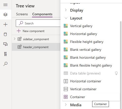
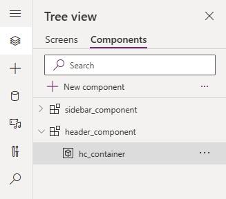
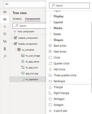
After creating a new component and renaming it to header_component let’s insert a container within it and rename it to hc_container.

create header
create header
Fig – 1: Adding Container in Newly Created Header Component

Time to set up some property.

Header_component:

				
					Width:640
Height:80 


Don’t worry this is not a fixed width or height. It will be used for now in design only, later when we will use this component on a screen, we can resize the component, and this width and height will be changed based on those values. We are using a reasonable height for a header to get proper visualization during designing it.

Now let’s set hc_container’s width and height relatively.

				
					hc_container:
	Width: Parent.Width
	Height: Parent.Height


Now time to color the header, but it should be configurable. So let’s create a custom property.

create header
Fig – 2: Creating Custom Property bg_color

Then set the property color as hc_container’s Fill property.

For now, we can use white color as the value of bg_color property.

				
					hc_container:
    Fill: RGBA(255,255,255,1)


Simply we can show any company icon or any preferable icon on the left side and User info on the right side of the header.

After inserting the following items and setting those properties the component will look like ss:26

				
					hc_app_icon: 
	Icon: Icon.LogJournal
	Width: Self.Height
Height: Min(45,Parent.Height/2)
X: 20
	Y: (Parent.Height - Self.Height)/2
	DisplayMode: DisplayMode.Disabled
	DisabledColor: RGBA(50,80,195,1)
	DisabledFill: RGBA(255,255,255,1)


					hc_app_name:
	X: hc_app_icon.X + hc_app_icon.Width
	Y: hc_app_icon.Y + hc_app_icon.Height - Self.Height
	Width: 	150
	Height: hc_app_icon.Height
	Font: Font.'Dancing Script'
	Size: 16
	Align: Align.Left
	VerticalAlign: VerticalAlign.Bottom
Color: RGBA(50,80,195,1)
Fill: Transparent


					hc_user_image:
	Image: User().Image or Pick any Image
	X: Parent.Width - Self.Width - 20
	Y: (Parent.Height - Self.Height)/2
	Width: Self.Height
	Height: Min(35,Parent.Height/2)
	BorderRadius: 40
				
			
Fig – 3: Header Component after setting properties

Now we may want to make a rounded background for the icon. Unfortunately, right now Icon does not have any Border Radius property to round it border. But we know how to get work done. Let’s insert a button (item with border-radius property), rename it to app_icon_bg, and set its property like the below-

				
					app_icon_bg:
	X: hc_app_icon.X
	Y: hc_app_icon.Y
	Width: hc_app_icon.Width
	Height: hc_app_icon.Height
	DisplayMode: DisplayMode.Disabled
	Text:””
	DisabledFill: RGBA(50,80,195,1)
	BorderThickness: 0
	Border Radius: 10


Setting hc_app_icon’s background to transparent.

				
					hc_app_icon:
	DisabledFill: Transparent


After setting all properties header component will look like  fig-4.

header & footer
Fig – 4: After making background rounded.

Let’s add a separator within header_component to highlight the header portion like Fig 5 –

Fig – 5: Screen with Sidebar and Header component.

For that, we need a rectangle shape. Let’s insert a rectangle shape, rename it to hc_seperator and then set its properties like the below-

				
					hc_seperator:
	Width: Parent.Width
	Height: 1
	X: 0
	Y: Parent.Height – 1
	BorderThickness: 0
	Fill: ColorFade(RGBA(56, 96, 178, 1),90%)
				
			
Fig – 6: Adding shape for highlighting Header component

Footer Component:

Now let’s create another component to use as a footer for each screen.

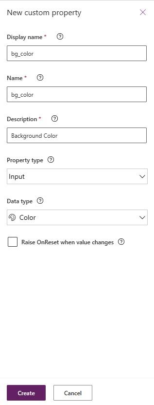
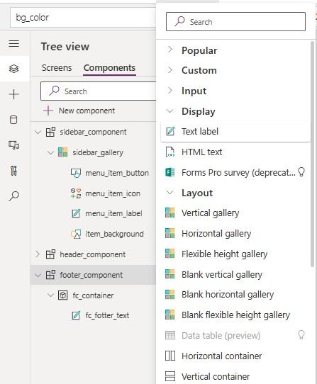
Inserting a new component and renaming it to footer_component let’s create a custom input property for the component to control its background color.

				
					Custom Property: 
bg_color: 
Property type: Input
			Data Type: Color


After that let’s insert a container within it and rename it to fc_container. Within Container let’s insert a “Text Label” and rename it to fc_footer_text.
Now let’s set properties for that element like below-

				
					footer_component:
	bg_color: (255,255,255,1)	
	Width: 640
	Height: 35


					fc_container:
	X:0
	Y:0
	Width: Parent.Width
	Height: Parent.Height
	Fill: bg_color
	BorderThickness: 0


					fc_footer_text: 
	X:0
	Y:0
	Width: Parent.Width
	Height: Parent.Height
	BorderThickness: 0
	Fill: Transparent
	Size: 11
	Text: "Copyright " & Text(Now(),"yyyy") & ". All rights reserved."
Align: Align.Center
	Color: RGBA(51, 51, 51, 1)
				
			
Fig – 7 : Creating Footer Component

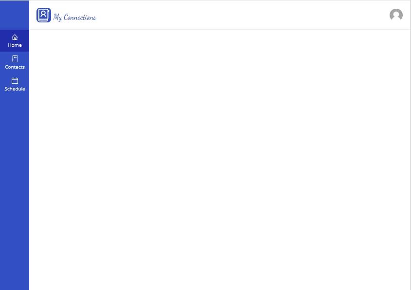
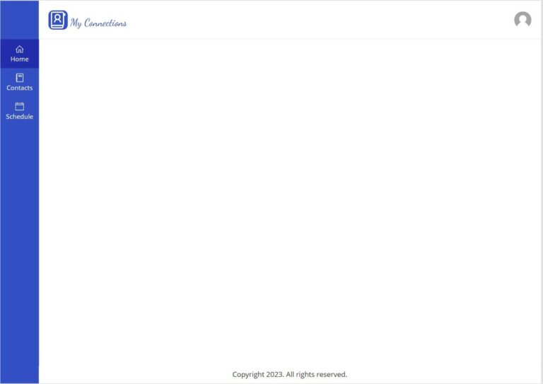
Now let’s insert these components into our screen to see how they look together. 

After inserting all 3 components we created it will look like below.

Fig – 8 : Screen with All three components (Sidebar, Header & Footer)

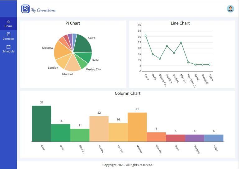
Eventually, when our “Home” screen will be filled with graphs and charts it will look like Fig-9.

footer component
Fig – 9: Screen with some dummy graphs and newly created components

Till now we have learned-

  1. About Component
  2. Uses of Component
  3. How to Create a Component
  4. How to make components configurable
  5. How to use a component on a screen.

Final Word

In conclusion, the Header & Footer component is a powerful feature of PowerApps that allows you to create a consistent user interface and navigation throughout your app.

By following the steps outlined in this article, you can easily create and customize your own Header & Footer component according to your specific needs.

Tech Stack
0 +
Accelerate Your Software Development Potential with Us
With our innovative solutions and dedicated expertise, success is a guaranteed outcome. Let's accelerate together towards your goals and beyond.
Blogs You May Love

Don’t let understaffing hold you back. Maximize your team’s performance and reach your business goals with the best IT Staff Augmentation