


In our previous article, we explored the process of creating a custom component in PowerApps.
In this article, we will continue our journey into PowerApps by delving deeper into the customization of components. Specifically, we will focus on making components configurable, which allows end-users to customize and adjust various aspects of the component to fit their specific needs. By making components configurable, we can create more flexible and versatile applications in PowerApps. So, let’s continue our exploration of PowerApps and learn how to make components configurable.
Since reusing a component throughout the application is our main goal, we are going to create it with maximum configurability. To enhance the configurability of a component PowerApps provides the concept of custom properties, which will be discussed and implemented later in this article.
We already have created a Component named “sidebar_component” which has been demonstrated in the last part of the article.
Currently, this component uses a predefined table as a source which providing name, icon and respective Screen control for each item of the sidebar menu.
Since we want to reuse the component in different screens even in different application, we must need a facility to provide the source from outside of the component.
Here PowerApps introduces the Custom Property concept in the component. Let’s create a custom property to pass a collection/table as a data source.
Creating Custom Property
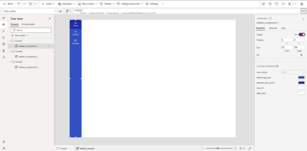
To create a custom property, first, we need to click on sidebar_component in the left panel, then from the right panel we can find the “New custom property” button. Clicking on the button we will get a form to fill in the necessary information and set the preferable type for the custom property.
Since we are going to use it as an input property, we are going to select “Input” under the Property Type option. We already mentioned it will pass a table as source for the gallery, so we are going to select “Table ” under Data type option. We are going to check “Raise OnReset when value changes” so that whenever the table changes the sidebar resets on its own.
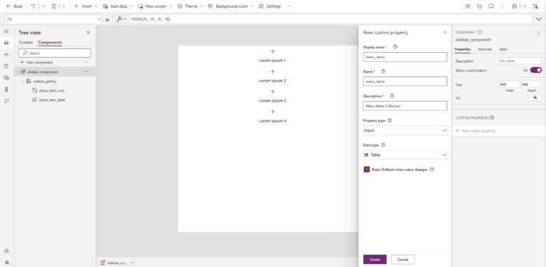
By clicking on Create button our custom property (menu_items) will be ready to use.
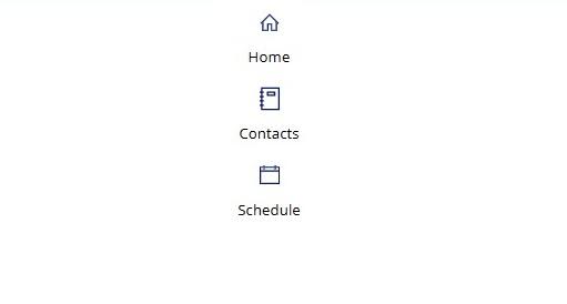
We just created the custom property, now let’s set a value for it to be visible in our component.
After clicking on the sidebar_component from left panel we can select our menu_items property from property list. Inside right box of property we can set the value for our property. Let’s set the following table as menu_items.
					Table(
    {id:1, name:"Home", icon:Icon.Home, screenToNavigate:App.ActiveScreen},
    {id:2, name:"Contacts", icon:Icon.Notebook, screenToNavigate:App.ActiveScreen},
    {id:3, name:"Schedule", icon:Icon.CalendarBlank, screenToNavigate:App.ActiveScreen}
)
It’s the same table that was provided in the previous part of the article.
Now time to use some color to make it look better. And again we are going to use some custom properties to color it, so that we can control the color from outside of component easily.
Let’s think for a second and try to find out which items need to be colored and if any color should change over activity or event.
At this basic phase, we may consider 4 colors –
- Background color for sidebar
- Selected Menu Color
- Icon’s fill color
- Menu Label color
Though we can use the same color for Menu Icon and Label, we will try to make it much configurable as possible.
So, now we should create 4 Custom Properties for sidebar_component.
Each of those 4 custom property will be of input type and their data type will be Color.
After creating those 4 custom properties let’s rename those to-
- default_bg_color
- selected_item_color
- item_fill
- label_color
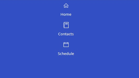
After renaming let’s set the color for those properties like the below for now to check the effect-
default_bg_color :RGBA(50,80,195,1)
selected_item_color :RGBA(33, 45, 170, 1)
item_fill :RGBA(255, 255, 255, 1)
label_color :RGBA(255, 255, 255, 1)
Do you notice any changes in the view of the sidebar component?
We can’t notice any changes as we haven’t used any of those properties in our gallery yet.
Let’s use those properties to color the component by setting the following properties of different elements-
					Sidebar_component:
	Fill: Self.default_bg_color
sidebar_gallery:
	Fill: Parent.default_bg_color
menu_item_icon:
	Color:sidebar_component.item_fill
menu_item_label:
	Color:sidebar_component.label_color
After setting all those properties the changes will be visible like below.
Now let’s insert a shape inside the gallery and rename it to item_background, then set its property like below-
					Item_background:
	X : 0
	Y : 0
	Width: Parent.Width
	Height: Parent.TemplateHeight
We can color this shape (item_background) with selected_item_color and keep it transparent when it’s not selected.
But how will we know which menu item is on our current screen?
Recall, we can provide screen control as the value of screenToNavigatecolumn in the Source Table, which will help us to know the matching screen.
Now we need to know the current screen. Using App.ActiveScreen we can easily access the current screen. So we can set a logical color for item_background like below-
					item_background:
Fill: If(App.ActiveScreen = ThisItem.screenToNavigate, sidebar_component.selected_item_coolor, Transparent)
Notice all our menu item’s backgrounds yet look the same. Why?
Recall, we set screenToNavigate property of the source table to App.ActiveScreen in every row. And we had no other option then, because we did not create any screen at that point.
When we will send the source table from screens we will send different screen-control as value for different row of the table.
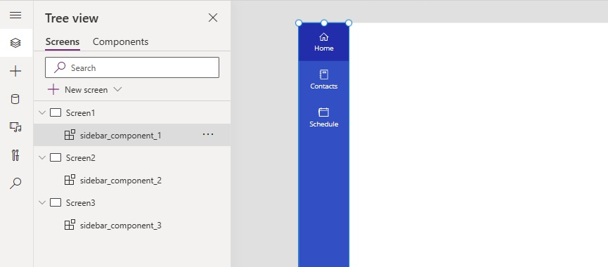
To understand it better let’s create some screens. After creating 3 screens named Screen1, Screen2 and Screen3, let’s insert our recently created custom component (sidebar_component) inside each screen. Then set menu_items property of each component like below-
					Table(
    {id:1, name:"Home", icon:Icon.Home, screenToNavigate:Screen1},
    {id:2, name:"Contacts", icon:Icon.Notebook, screenToNavigate:Screen3},
    {id:3, name:"Schedule", icon:Icon.CalendarBlank, screenToNavigate:Screen3}
)
At this point, our sidebar in a screen will look like the below –
It’s time to navigate from one screen to another using the navigation bar / sidebar we created.
Set OnSelect property of sidebar_gallery as shown –
					sidebar_gallery:
	OnSelect:Navigate(sidebar_gallery.Selected.screenToNavigate);
It works, but doesn’t it feel like something missing here?
Notice carefully the pointer visual does not change all over the menu item. Let’s add a button and make it transparent to get that feel since you only get pointer visual changed over a button element in PowerApps.
After adding a button and renaming it to menu_item_button, let’s set its property to –
					menu_item_button:
	X:0
	Y:0
	Text:""
	Width: Parent.Width
	Height: Parent.TemplateHeight
	BorderThickness:0
	Color:RGBA(255, 255, 255, 0)
	Fill:RGBA(255, 255, 255, 0)
	HoverFill:RGBA(0, 0, 0, 0.1)
Now it looks better and while hovering over the menu it reacts accordingly.
Notice the menu appears at the very top of the screen, what if we want it below any point. Let’s make it configurable.
For that we need another custom property, let’s create and rename it to menu_y.
					menu_y:
    Property type: Input
    Data Type: Number
Let’s set the value of menu_Y to 80 for Now.
Now the sidebar will look like below

Our screen looks better but something missing yet.
We need two more components for header and footer portion of the screen. We are going to create those components in the next part of this article.


